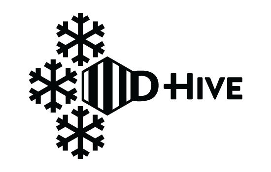
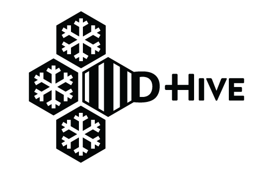
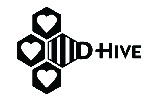
D-Hive Rebranding
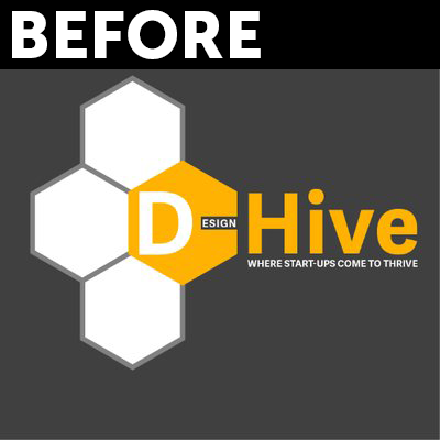
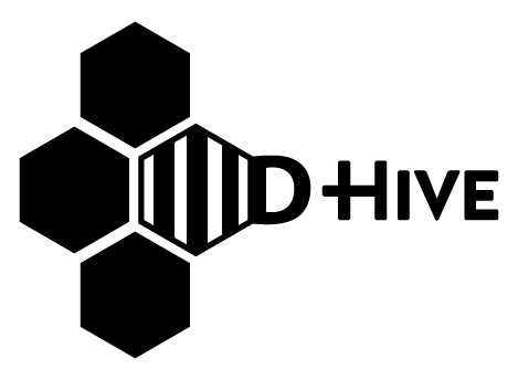
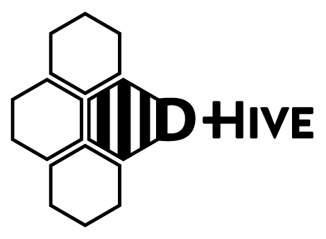
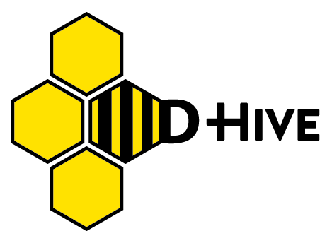
Design Hive needed a complete branding overhaul starting with its logo. I developed a two color logo based on their previous logo and to their specifications, reducing the number of colors used and removing text elements that did not read at a distance.
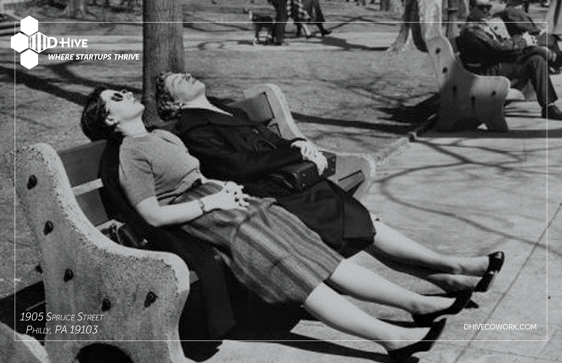
D-Hive Launch Event Signs & Invitations
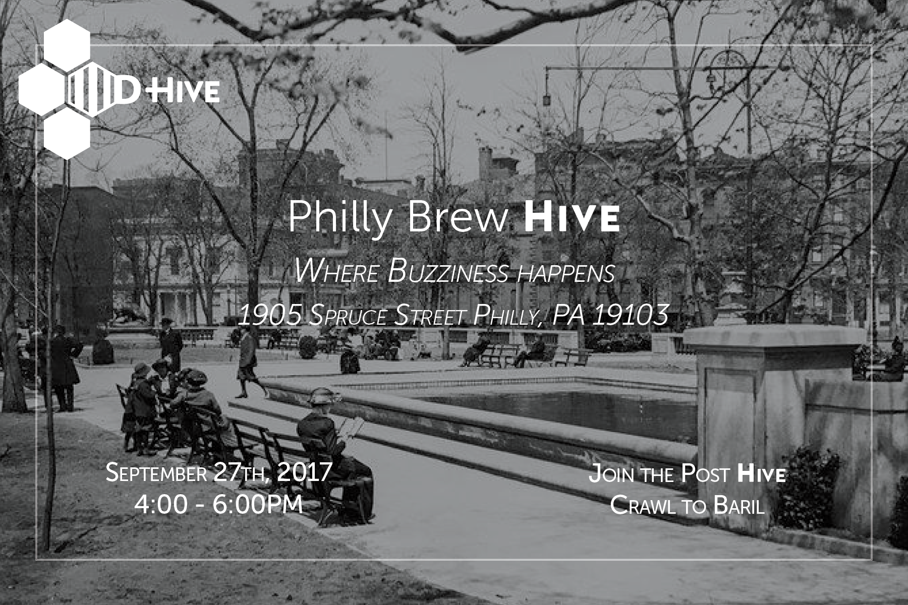
After developing a new logo for Design Hive, a theme and color scheme was defined, including historical imagery of Rittenhouse Square, and using copy developed by D-Hive themselves.
Black and White photos were paired with single color logos for print & web collateral, including two sided invitation cards and inline photos for Facebook, Instagram and other social media use.
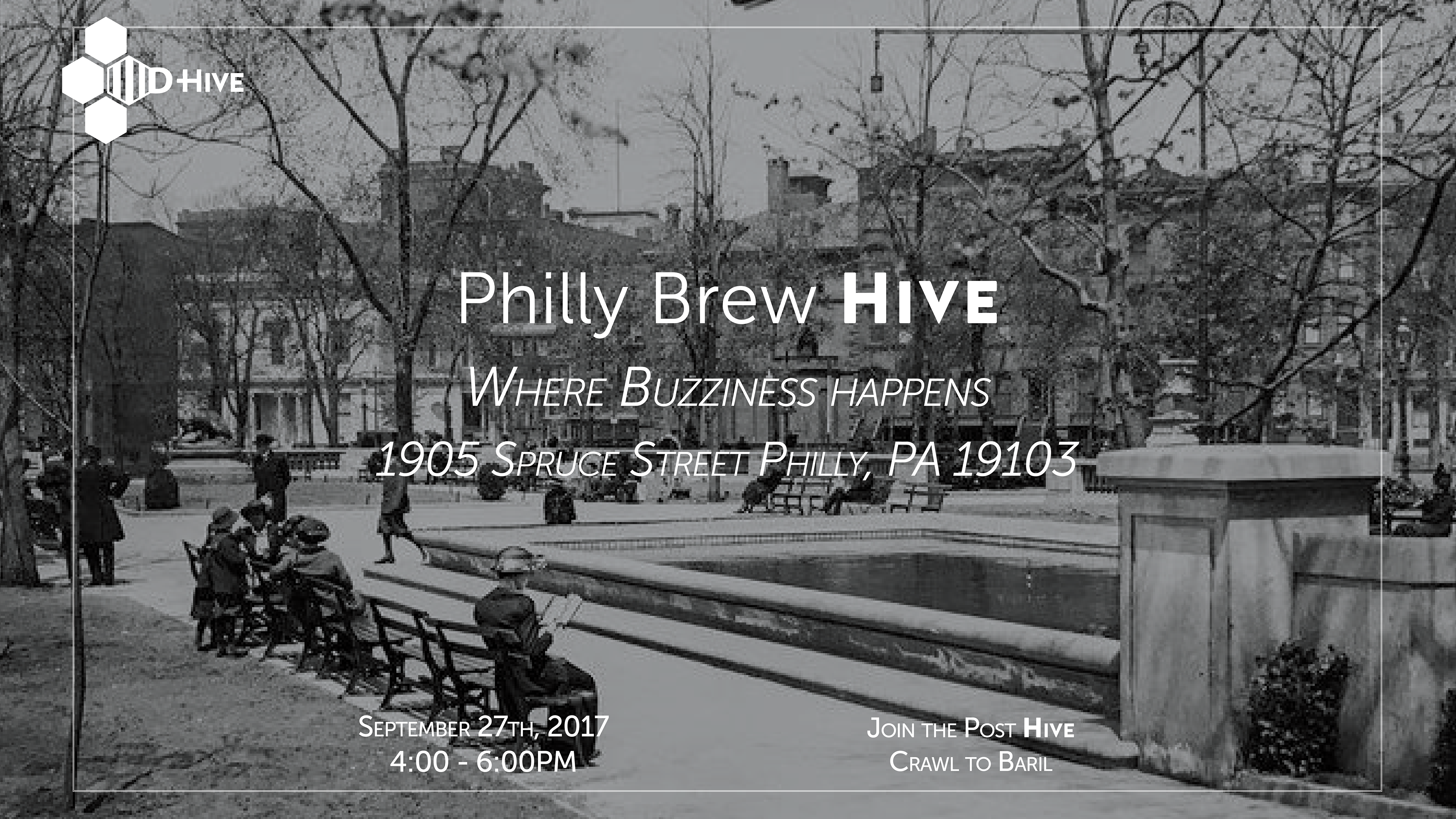

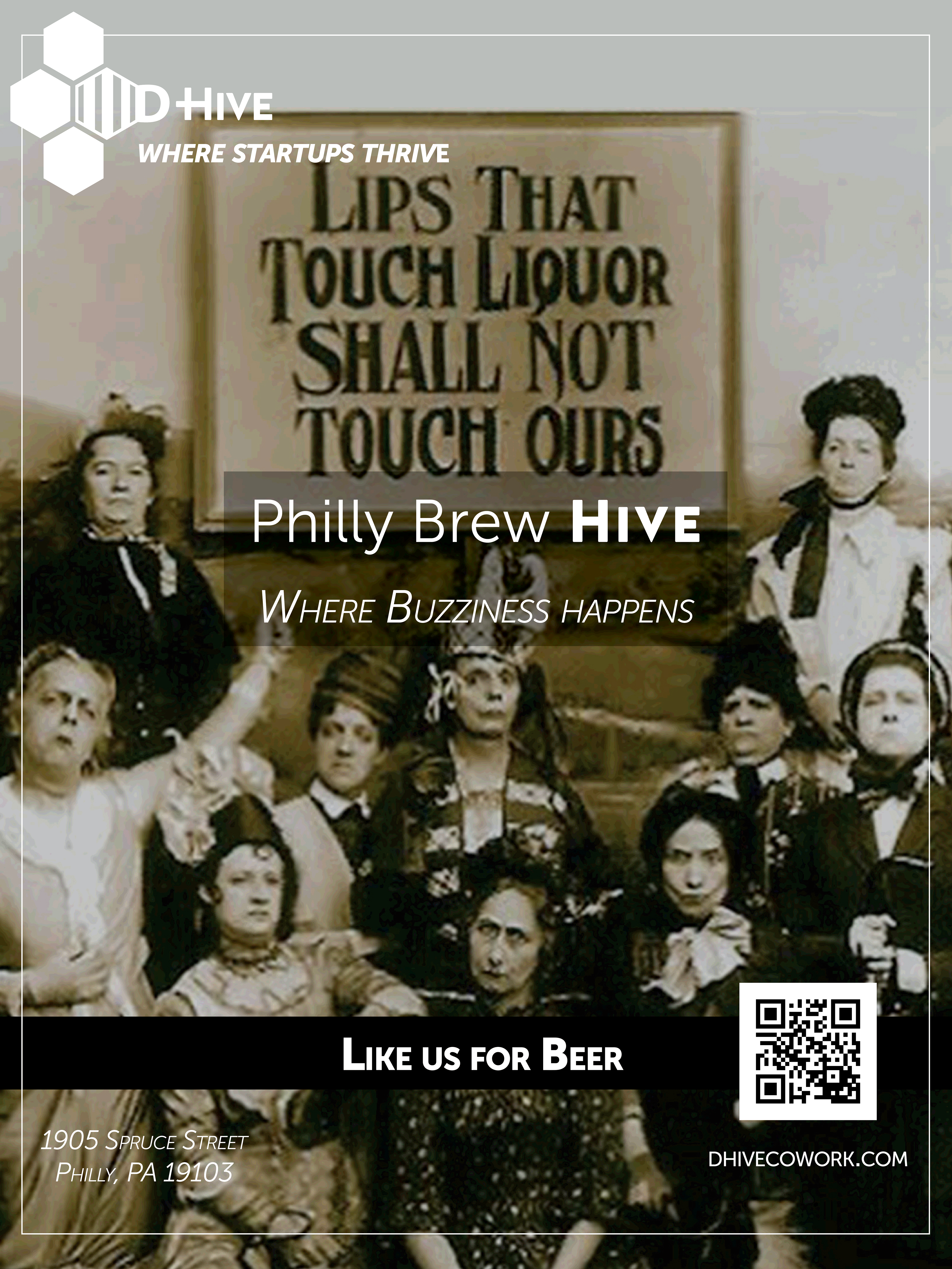
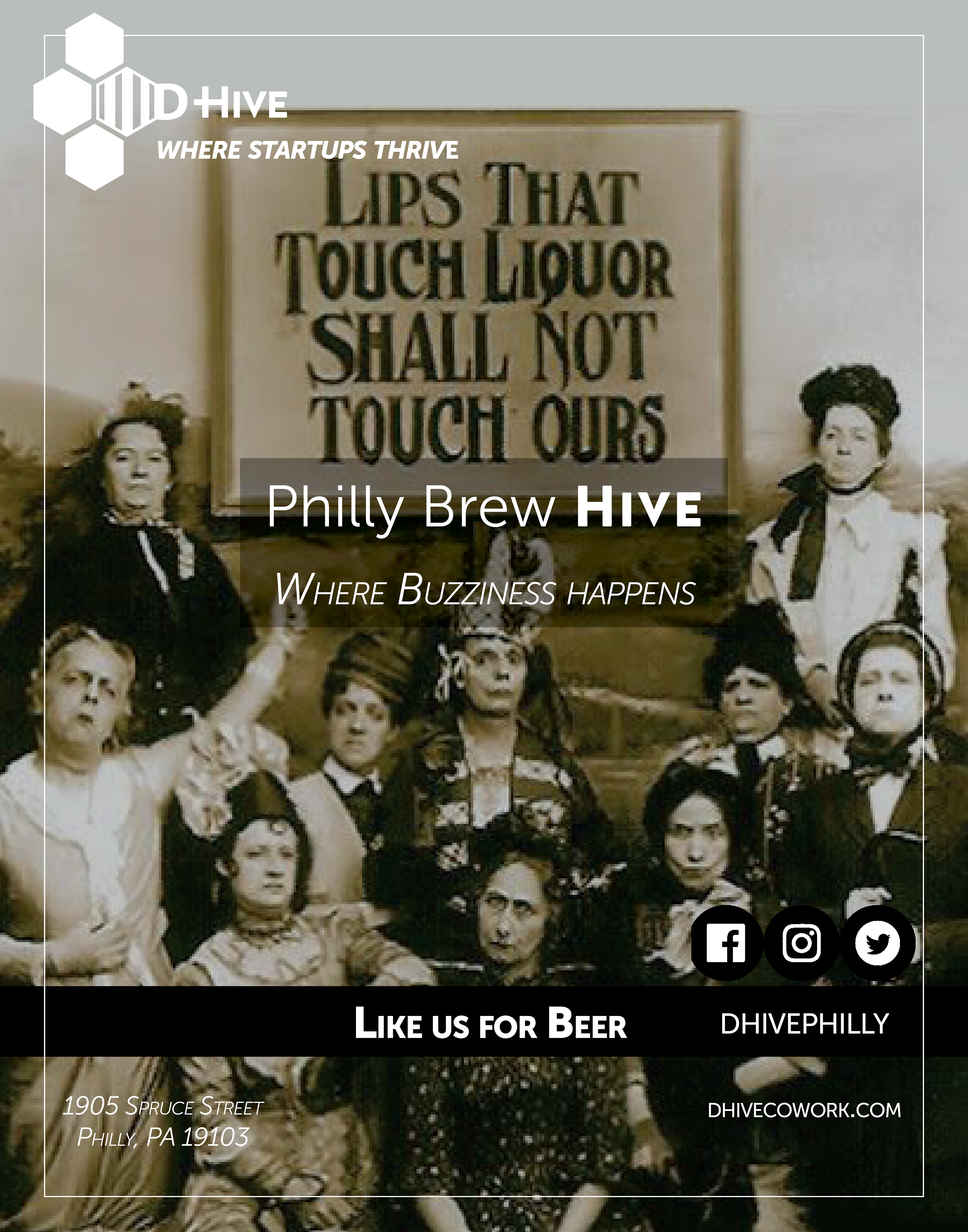
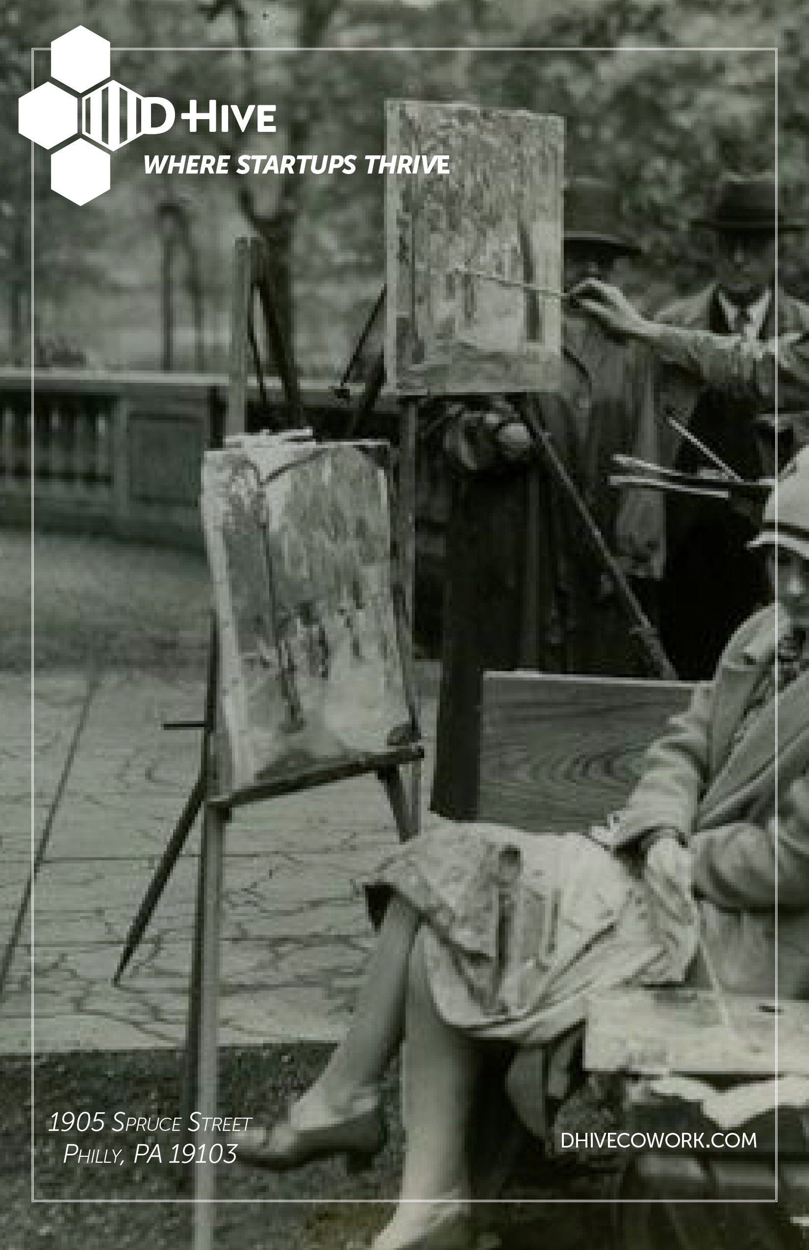
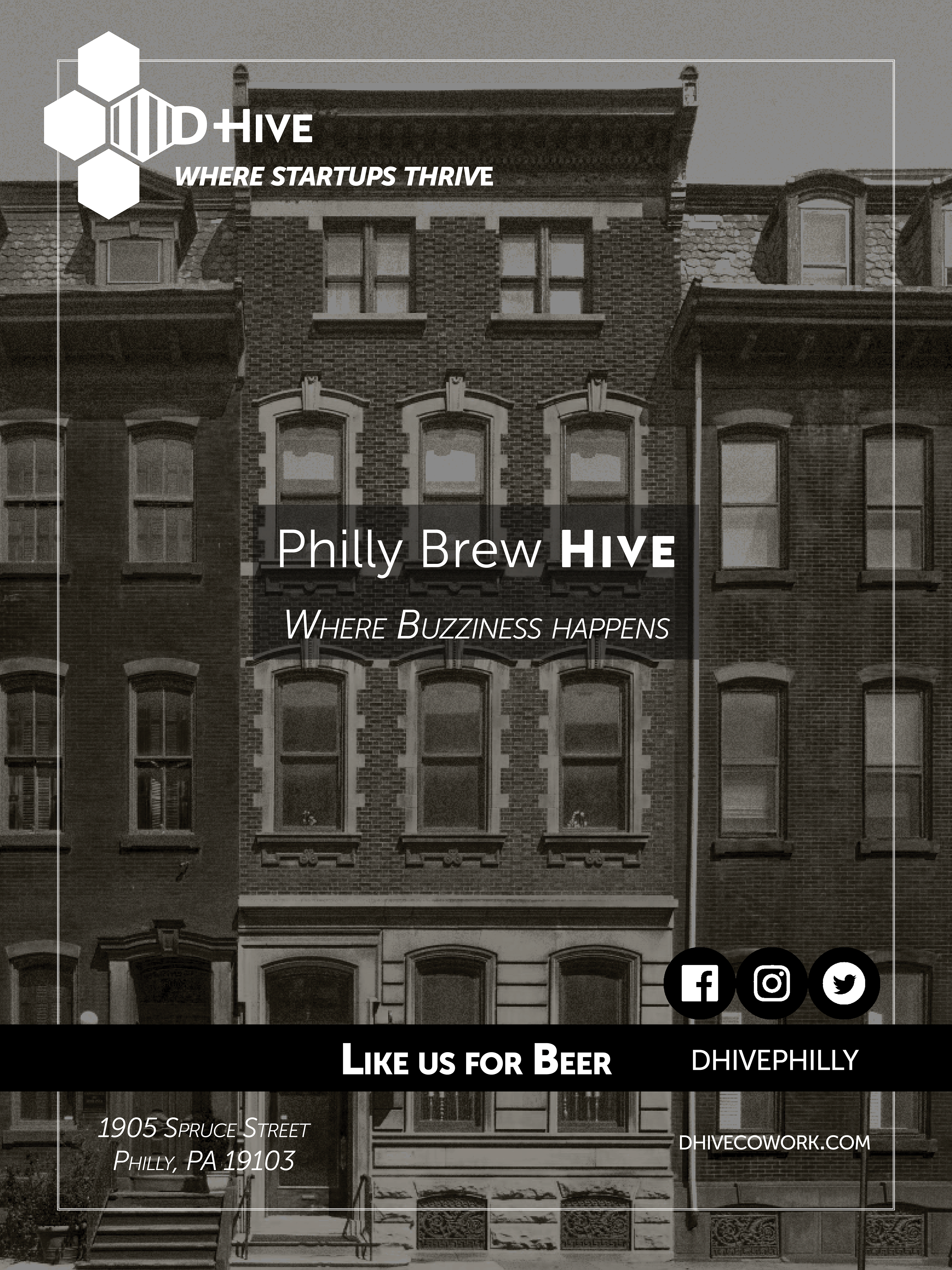
For the launch event, I was instructed to use a comical historical photo for an 18 x 24 inch sign including a QR code for guests to engage with. Unfortunately the QR code proved inappropriate for the event and yielded poor results, leading us to replace it with a set of social media buttons. The sign's layout was reused for a later event with the photo replaced with a shot of D-Hive instead.
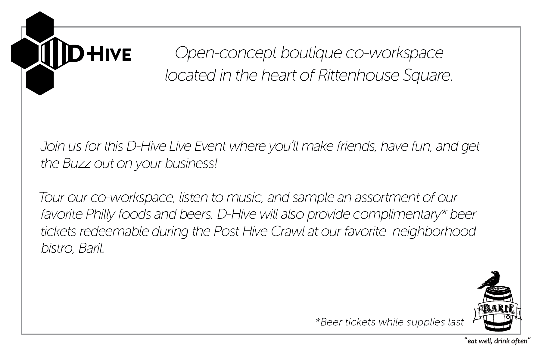
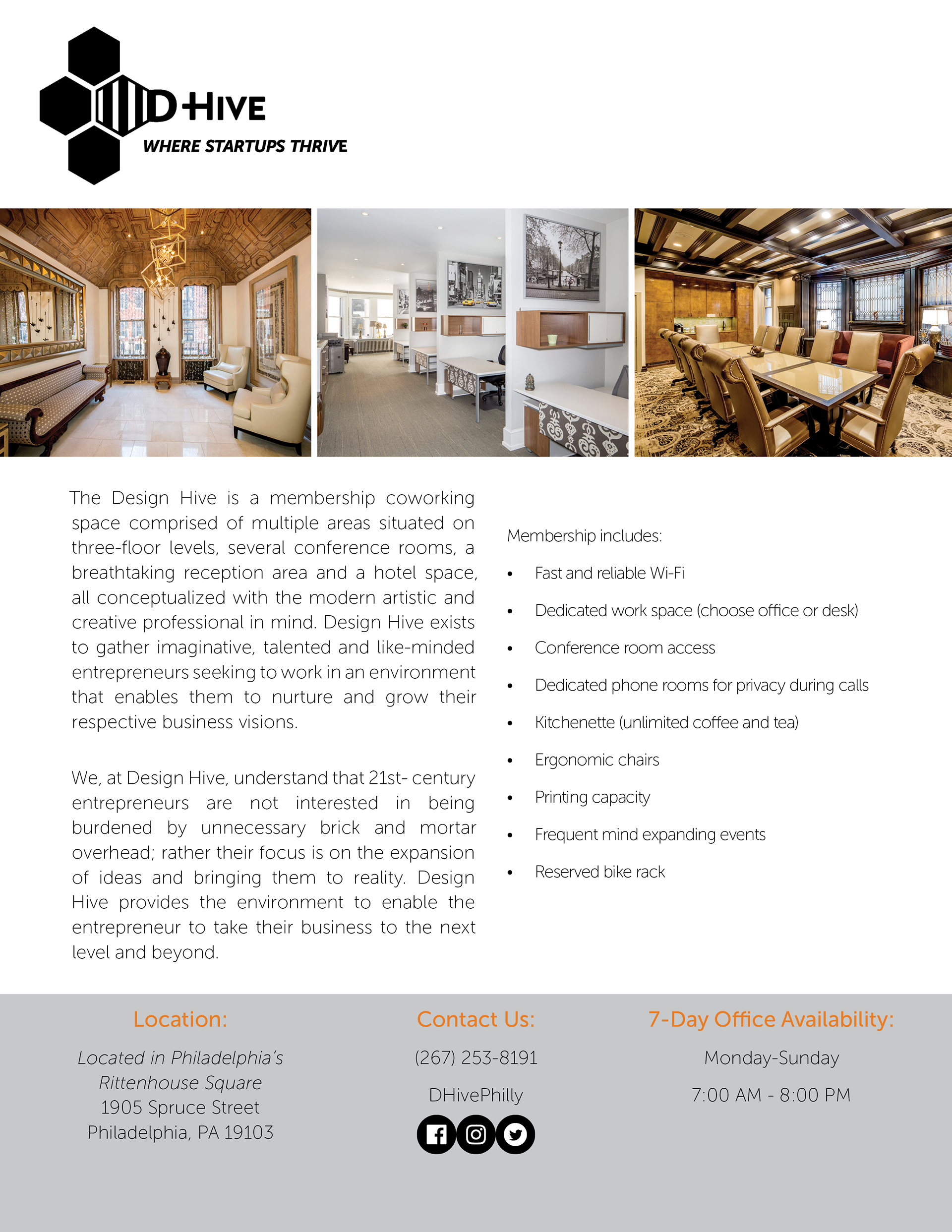
Launch Event Handout Materials
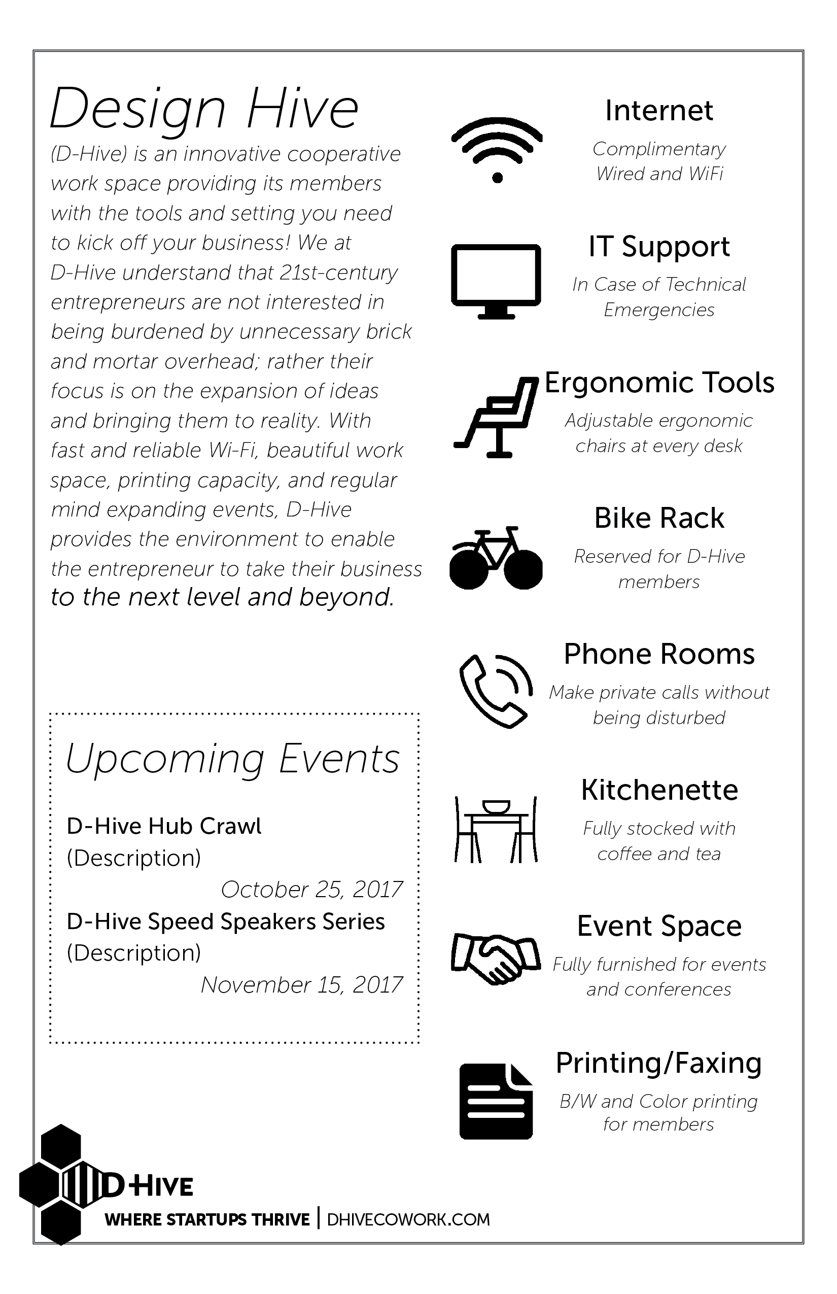
These informational cards were printed to be handed out to guests during the launch event.
Speed Speaker Series & Further Signage
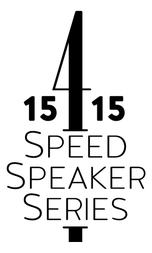
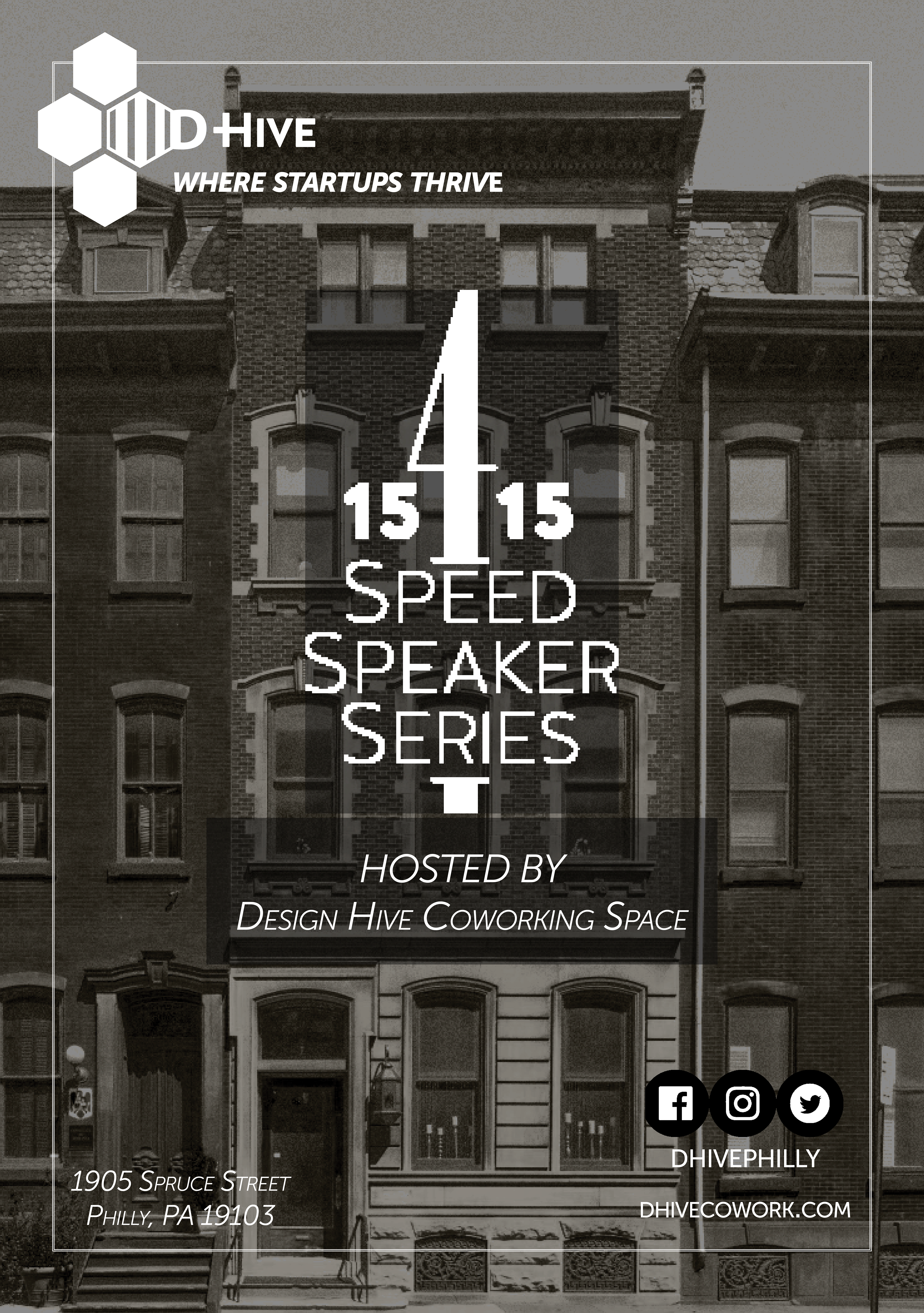
I was asked to develop a logo based on D-Hive's specifications for a speaker series event, as well as a remade large sized sign using a new photo.
Letterheads & One Page Marketing Materials

I established the rules D-Hive uses for marketing materials in a brand kit including all logos, fonts, palettes and other specifications for the proper use of the D-Hive brand.
D-Hive uses its color logo for all internal work and the monochrome variants for all marketing handouts.
D-Hive uses its color logo for all internal work and the monochrome variants for all marketing handouts.
Seasonal Logo Variants & Other Branding